This is just one case and point why the Heritage Foundation is not a good source for facts, making sound arguments or for sound opinions.
On September 15, 2014 the Heritage Foundation published this post, The War on Poverty After 50 Years. In this post they have the following graph:
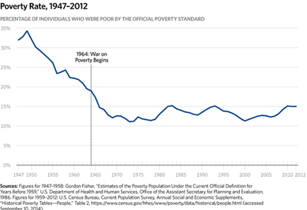
They make the argument that President Johnson’s war on poverty was a total failure.
Do the higher living standards of the poor mean that the War on Poverty has been successful? The answer is no, for two reasons. First, the incomes and living standards of less affluent Americans were rising rapidly well before the War on Poverty began.
The second reason was because they suggest that in spite of his stated goals he really only perpetuated government dependence and did nothing but spend money without any positive effect on poverty.
Although President Johnson intended the War on Poverty to increase Americans’ capacity for self-support, exactly the opposite has occurred. The vast expansion of the welfare state has dramatically weakened the capacity for self-sufficiency among many Americans by eroding the work ethic and undermining family structure.
They actually post the graph above twice in their article. This graph has been re-published many times on the web by right wing groups and Republicans as proof that government programs are ineffective and only exacerbate poverty1. Let’s take a look at their caption at the bottom of the graph citing their sources which they attribute to the Census Bureau.
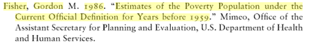
Sources: figures for 1947-1958: Gordon Fisher. “Estimates of the Poverty Population Under the Current Official Definition for Years Before 1959.- U.S. Department of Health and Human Services. Office of the Assistant Secretary for Planning and Evaluation, 1986 figures for 1959-2012: U.S. Census Bureau. Current Population Survey, Annual Social and Economic Supplements, ‘Historical Poverty Tables—People,” Table 2, https://www.census.gov/hhes/www/poverty/data/hstorical/people.html (accessed September 10, 2014).
Let’s take it apart…
Sources: figures for 1947-1958: Gordon Fisher. “Estimates of the Poverty Population Under the Current Official Definition for Years Before 1959.- U.S. Department of Health and Human Services. Office of the Assistant Secretary for Planning and Evaluation,
If you search for this work on the internet you will not find it. Why? Here is what you will find:
 2
2
Here is another:
 3
3
Notice the word “Mimeo” in the first reference and the phrase “Unpublished Paper” in the second reference which was conveniently left out of the Heritage citation. Mimeo means:
(unpublished paper): May refer to a paper that is not in the process of being published or that is not part of an institutional working paper series.4
This word in bibliographies came about from the word mimeograph. It is thought the common usage was for mimeograph copies of a professors unpublished papers. The real problem is that without an official publication the authenticity of the source cannot be verified. Anyone can make the claim without any proof whatsoever that the source is authentic.
To be fair they do state in their references at the bottom of their article that, “These estimates are not official government figures.” They also state that the authors will provide the mimeograph copy upon request of the unpublished data.
1986 figures for 1959-2012: U.S. Census Bureau. Current Population Survey, Annual Social and Economic Supplements, ‘Historical Poverty Tables—People,” Table 2, https://www.census.gov/hhes/www/poverty/data/hstorical/people.html (accessed September 10, 2014).
Try to find this on the Census Bureau web site. You will not find it. In fact, I am not an expert but I am a long time software engineer and I do not believe a second “www” in a URL as above is not even allowable. I have never seen a URL like this.
I did do a search with information they cite and found this, “Income and Poverty in the United States: 2013”
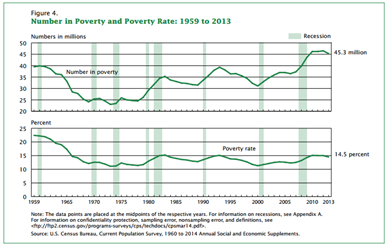
This does not show us anything about the years 1947 to 1959 as the Heritage Foundation’s graph shows. I suppose we are to assume the spike down they show on their graph comes from the unpublished paper that they state at the bottom of the article was interpolated from the mystery document. In any case, the graph from 1959 to 2012 appears similar:
Without the 1947 to 1959 data authenticated by their source, their case based on their source is not nearly so dramatic as the post would have us believe. However, I do think that this part of the graph is feasible.
Let’s not forget that the Great Depression and World War II ran from 1929 to 1945.5
By the end of the 1930s, 17% of the American work force remained unemployed; 30% still lived in poverty6
Historians see the Great Society of LBJ as a continuation of another Democrat’s attack on poverty, FDR’s New Deal. The New Deal legislation ran from 1933 to 1938. The New Deal legislation included Social Security, massive fiscal spending on infrastructure, housing and farming legislation. Certainly, spending on the war also inserting much needed short term stimulus into the failing economy. It is debatable how much effect the non-recurring, short term stimulus spending on the war had on long term economic conditions in the U.S.. In any case, the Great Society spending of LBJ can easily be seen as an extension of the New Deal. The poverty curve started coming down with FDR and continued downward dramatically until the Reagan years. In the Heritage article there is no mention of these topics. The truncation of this curve starting in 1947 instead of 1929 conveniently ignores the most important part of why the poverty curve came about and why it was going down dramatically in 1947. Additionally, if you believe the authors, the war on poverty had a dramatic but unreported effect on the “affluence” (they resist this word at the same time implying it) of the poor.
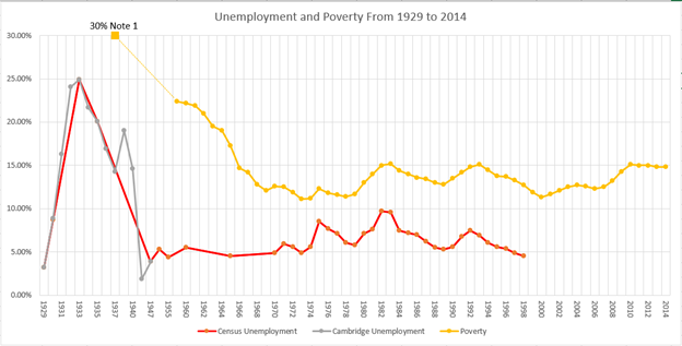
The data for poverty during and just after the Great Depression is hard to come by since there was no standard established. However, there is some Census Bureau data on unemployment during those years. The red line on the graph below shows data points from the Census Bureau starting in 1929.7 The blue line shows data points given by Historical Statistics of the United States published by the Cambridge University Press.8 The orange line shows poverty data points already discussed given by the Census Bureau.9 Note 1 – This data point was from the previously mentioned link, ECONOMY IN WORLD WAR II: HOME FRONT. The chart shows data from 1929 to 2014. This chart shows the relationship of unemployment to poverty during those years. In the chart, poverty lags unemployment by 12 to 15 years after the Great Depression.10 While actual data on poverty is lacking during the early years, it is reasonable to assume that poverty at this time would follow a similar trajectory as unemployment. This gives us some insight into what poverty would have looked like through the Great Depression. It is interesting to note that the unemployment recovery started around 1933 when FDR was kicking off the New Deal. Poverty started coming down dramatically some time from the late 1930s to the mid-1950s.
The Heritage article goes on to state in their Amenities section:
Because the official Census poverty report undercounts welfare income, it fails to provide meaningful information about the actual living conditions of less affluent Americans. The government’s own data show that the actual living conditions of the more than 45 million people deemed “poor” by the Census Bureau differ greatly from popular conceptions of poverty. Consider these facts taken from various government reports:
•Eighty percent of poor households have air conditioning. By contrast, at the beginning of the War on Poverty, only about 12 percent of the entire U.S. population enjoyed air conditioning.
•Nearly three-quarters have a car or truck; 31 percent have two or more cars or trucks.[9]
•Nearly two-thirds have cable or satellite television.
•Two-thirds have at least one DVD player, and a quarter have two or more.
•Half have a personal computer; one in seven has two or more computers.
•More than half of poor families with children have a video game system such as an Xbox or PlayStation.
•Forty-three percent have Internet access.
•Forty percent have a wide-screen plasma or LCD TV.
•A quarter have a digital video recorder system such as a TIVO.
•Ninety-two percent of poor households have a microwave.
On one hand they try to use Census data from 1959 referenced above to show that government spending has not reduced poverty since the 1960s but only increases government waste. Then, they go on to state that the data the authors used does not accurately reflect poverty thus weakening their argument that poverty has not gone down with additional spending. If those living below the poverty level have all these amenities it would imply that they are doing quite well so the programs combating poverty must be working too well.
The authors do go on to state:
Of course, poor Americans do not live in the lap of luxury. The poor clearly struggle to make ends meet, but they are generally struggling to pay for cable TV, air conditioning, and a car, as well as food for the table. The average poor person is far from affluent, but his lifestyle is equally far from the images of stark deprivation purveyed by advocacy groups and the mainstream media.
If the poor are struggling to pay for what middle class families are paying for this implies that the poor are really middle class or at least lower middle class. Thus, poverty has effectively been eradicated by government programs and spending on the poor. However, they think that the elimination of poverty which they imply but at the same time deny is not shown in government reporting on poverty. Could it be that if we had the ‘real’ numbers for the graph above it would not be flat from the 1960s on but would actually go down further thus continuing the earlier more dramatic trend down? No, they prefer to have their cake and eat it too.
They think the Census data under-reports the real living conditions of the poor.
The Census Bureau counts a family as “poor” if its income falls below specific thresholds, but in counting “income,” the Census omits nearly all of government means-tested spending on the poor.[4]
The note [4] states:
[4] Typically, only 3 percent of total means-tested spending is counted by the Census as “income” for purposes of deriving the official poverty measure.
There is no reference for the “3 percent” number.
Again, they go on to state:
Some authors suggest that the continuing decline in official poverty from 1965 to 1970 demonstrates the initial success of the War on Poverty, but over 90 percent of the increased spending during this period was in the form of non-cash benefits that the Census does not count for purposes of measuring poverty.[20]
Note [20] states:
[20] Data available from the authors upon request.
Try asking them for the data and see what happens.
Pew Research has an interesting article stating:
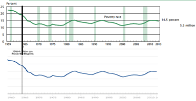
Critics note that the official poverty rate, as calculated by the Census Bureau, has fallen only modestly, from 19% in 1964 to 15% in 2012 (the most recent year available). But other analysts, citing shortcomings in the official poverty measure, focus on a supplemental measure (also produced by the Census Bureau) to argue that more progress has been made. A team of researchers from Columbia University, for example, calculated an “anchored” supplemental measure — essentially the 2012 measure carried back through time and adjusted for historical inflation — and found that it fell from about 26% in 1967 to 16% in 2012.11
As it turns out food stamps and some welfare benefits are not reported to the IRS. However, since IRS data does not go outside the agency for reporting purposes the source for all these claims generally comes from the Census Bureau. The Census Bureau does get self-reporting information on government assistance. Self-reporting is also used for the authors arguments in the “Amenities”, “Poverty, Nutrition, and Hunger” and “Housing and Poverty” sections. These sections go on to tell us that in addition to amenities, the poor are doing quite well with food and nutrition and homelessness is not nearly as bad as you might think. If self-reporting is problematic for some of their premises it should be problematic for all their premises.
Furthermore, if you go to the article, “Income and Poverty in the United States: 2013”, cited above Appendix A, you will see an article titled, “How Income is Measured”. It states that Census data does reflect additional income from the government:
For each person 15 years and older in the sample, the Annual Social and Economic Supplement (ASEC) asks questions on the amount of money income received in the preceding calendar year from each of the following sources:
1. Earnings
2. Unemployment compensation
3. Workers’ compensation
4. Social security
5. Supplemental security income
6. Public assistance
7. Veterans’ payments
8. Survivor benefits
9. Disability benefits
10. Pension or retirement income
11. Interest
12. Dividends
13. Rents, royalties, and estates and trusts
14. Educational assistance
15. Alimony
16. Child support
17. Financial assistance from outside of the household
18. Other income
If in fact those living below the poverty level have all those amenities, this does not change their reported income which is below the poverty level. If the assumption is that the government programs allow them to live like Kings or at least paupers in the Kings palace they must be doing so on less than Federal Poverty levels currently set at:
|
Family Size |
Annual |
Monthly |
Weekly |
|
1 |
$11,880 |
$990 |
$228 |
|
2 |
$16,020 |
$1,335 |
$308 |
|
3 |
$20,160 |
$1,680 |
$388 |
|
4 |
$24,300 |
$2,025 |
$467 |
The Heritage Foundation states:
For decades, the living conditions of the poor have steadily improved. Consumer items that were luxuries or significant purchases for the middle class a few decades ago have become commonplace in poor households.
They go on to state that all this affluence has resulted in the poor (who are not really poor) have nothing to do but have more babies:
Since the beginning of the War on Poverty, the absolute number of married-couple families with children in official poverty has declined, but as Chart 6 shows, the number of single-parent families in official poverty (or lacking self-sufficiency) has more than tripled, increasing from 1.6 million in 1965 to 4.8 million today. When the War on Poverty began, 36 percent of poor families with children were headed by single parents; today, the figure is 68 percent. [24]
There was the baby boom after the war in the economic recovery which affected absolute population numbers, married and unmarried births proportionally. Here is what the source they cite tells us:
Key findings
Data from the National Vital Statistics System and the National Survey of Family Growth
•Nonmarital births and birth rates have declined 7% and 14%, respectively, since peaking in the late 2000s.
•Births to unmarried women totaled 1,605,643 in 2013. About 4 in 10 U.S. births were to unmarried women in each year from 2007 through 2013.
•Nonmarital birth rates fell in all age groups under 35 since 2007; rates increased for women aged 35 and over.
•Birth rates were down more for unmarried black and Hispanic women than for unmarried non-Hispanic white women.
•Nonmarital births are increasingly likely to occur within cohabiting unions—rising from 41% of recent births in 2002 to 58% in 2006–2010.
So, unwed mothers includes those that cohabitate and are not legally married. National Health Statistics Reports tells us:12

This fact is conveniently left out of the discussion. Additionally, since nonmarital birth rates have declined since the late 2000s, government spending on poverty has risen dramatically due to the Great Recession starting in 2008 (with a Republican president and a majority in the U.S. Congress for six years prior) the causal link to increased government programs on poverty and unwed births appears problematic. The Heritage article was written in 2014. They should have had access to all this information but clearly omitted it. The fallacy of false cause is well known in statistics. As they say, it is a fact that people drowning is statistically correlated to eating ice cream. However, jumping to the conclusion that ice cream causes drowning ignores the fact that people eat ice cream in the summer which is when drownings most often occur.
To conclude, drawing conclusions from false and misleading sources leads to wrong opinions and therefore voters voting on false ‘facts’. When “corporations are people too” we have turned ourselves over to the universe of commercials which have a notorious history of being false and misleading. The vested interest of groups like the Heritage Foundation which have great financial resources can dish out trash like this article with the perception of reality. The marketing guys I worked with would say it like this “perception is reality”. The mainstream media which you would have to include Fox News and journalists like the ones in this article can simply invent reality with the appearance of truth and get it repeatedly copied all over the web and into the ‘common sense’ perceptions of average people who do not have the time or inclination to find out if it is so. There is a reason why we get the politicians we vote for and deserve; in engineering we simply say, Garbage In, Garbage Out.
_________________
1 US Poverty Rate – How the Great Society Programs Reversed its Decline
2 This is a reference citation in another book called “Poverty in America: A Handbook”
3 This is a reference citation in another book called “Changing Poverty, Changing Policies”
4 Read more at http://www.yourdictionary.com/mimeo#0uIuWkPes886P72I.99
5 The Great Depression and World War II, 1929-1945
6 ECONOMY IN WORLD WAR II: HOME FRONT
7 Census Bureau, No. 1430. Employment Status of the Civilian Population: 1929 to 1998 (page 879)
8 Historical Statistics of the United States: Millennial Edition, ed. Susan Carter, Scott Sigmund Gartner, Michael Haines, Alan Olmsted, Richard Sutch and Gavin Wright (Cambridge: Cambridge University Press, 2006), http://hsus.cambridge.org/, accessed 5 January 2009.
9 Income and Poverty in the United States: 2013
Current Population Reports
Issued September 2014 P60-249 By Carmen DeNavas-Walt and Bernadette D. Proctor
10 It is interesting to note that the poverty rate has also lagged the unemployment rate during the Great Recession.
The recession officially lasted from December 2007 through June 2009, but monthly unemployment rates remained above 9 percent for more than two years after the official start of the current economic recovery.
Poverty and the Great Recession
Sheldon Danziger, University of Michigan,
Koji Chavez, Stanford University &
Erin Cumberworth, Stanford University
11 January 13, 2014, Who’s poor in America? 50 years into the ‘War on Poverty,’ a data portrait, By Drew DeSilver
12 National Health Statistics Reports
Number 64 April 4, 2013
First Premarital Cohabitation in the United States:
2006—2010 National Survey of Family Growth